An RC Weather site update, plus a micro visual language
 Tuesday, January 27, 2015 at 12:02PM
 I continue to greatly enjoy developing my simple "at a glance" weather app for outdoor activities. Currently it's located at the default Heroku development domain rc-weather.herokuapp.com, but I should probably register a domain and get things configured to use it (feedback has been positive). The first thing I love about this project is the simple joy of writing a web application. I've barely dabbled with the fundamentals in the past, but it feels like I'm getting in touch with my Internet geek heritage. HTML, CSS, a little JavaScript, web frameworks - all tasty and relatively straightforward, modulo the quirks that come from the web's organic development.
My first prototype was in Groovy and Grails, mainly because I wanted to explore that language and framework, but it was soon apparent that they were overkill for this app, which has no data model at all! So I switched to Python, a language I'm fairly comfortable with from work, and Flask for the back end. What a breath of fresh air! I continue to enjoy Python for all the usual reasons (dynamic typing, interactive shell for exploring, huge inbuilt and third party library, etc.), and Flask's model is so clean - simply annotated routes, practical templating, useful plugins, and an included development server that makes a sweet web "REPL" workflow - save files and then reload the browser page.
Other tools
Heroku's hosting is pretty slick. Once you figure out the basics (Procfiles, requirements.txt, runtime.txt for Python 3, and of course the ever-painful Git), updating the site is just a 'git push heroku master'. Of course this app is dead simple (no database), but Python + Flask on Heroku is productive.
Templates: I'm using the included Jinja2 templates, which work fine so far. The MVC is clean (routes include objects as keywords in their returned renderers) and the features are adequate so far.
Style: So far I've been focusing strictly on functionality, so the site looks like a vanilla HTML one, but I'm excited to learn Twitter's Bootstrap for the front end. I'll likely use JQuery for interactive features, and some kind of UI library. I'm intrigued by D3 , though it's more of a nail looking for a hammer (if that strained metaphor makes any sense). Basically it's cool and I want to use it for something :-)
And the basics: The awesome IntelliJ IDEA, Aquamacs (Emacs familiarity is from my NASA AI and Symbolics days early in the Shuttle program), the Mac OS X Terminal, and Firefox with its yummy developer tools.
Collaboration
I tend to be a lone wolf, but I realize that it leads to major limitations in finished products. So it's been gratifying and productive to get help from a few sources, including a small group at the HeliFreak forums (the active post is here), my brother and fellow programmer Dave, and a few colleagues here and there.
Challenges
Really, there are only two non-technical intellectual challenges that I see: 1) the function that computes an hour's color based on the weather parameters (probability of precipitation, wind, apparent temperature, and soon cloud cover), and 2) how to indicate visually this information in an weekly calendar format.
For number one, right now it's a simple three step process (summary and ASCII Vision (TM) here): Give each parameter a low/medium/high desirability rating based on ranges, combine them into one of four hourly ratings (poor, fair, okay, or great) using simple logic based on counts, and map each directly to a color (CSS). I need to change the second function to handle a fourth parameter (cloud cover), and add support for weighting the parameters somehow. It's clear from the forums that customizing these is important because personal preferences vary. Right now I have a form for editing ranges, but sliders are appealing, esp. if they update dynamically the colors.
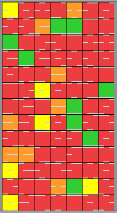
Number two is more interesting. How does one show each hour's overall rating along with information about the individual parameters' contributions without cluttering the display? I think it's correct to call this a micro visual language, one that has to convey "How good is that hour and why do you say that?" My initial idea was a weekly grid of colored squares like this:![]()
An obvious approach is keeping the square empty except for color, and supporting an interactive exploration of each, say by having an information panel that shows detail for the hour that the mouse is over. But I'm resolute about putting all information in each cell because I don't want to have to search to understand the overall picture. This will be probably be more mobile-friendly too.
I played with adding unlabeled small bars at the bottom of each square, but relying on position to indicate the parameter was confusing. I suppose I could have used a graphics editor to create the prototype, but I programmed a random selection of squares using of Pillow ("the 'friendly' Python Imaging Library fork"). Here's the one I did:
My present solution - not especially novel - is to place icons representing the troublesome parameter inside of each square. Finding good ones is a challenge, but I think my 0.1 icons from erikflowers.github.io/weather-icons are, in Alan Kay's, "good enough to criticize" *:
Can you intuit the icons' meanings? Here's the key:
![]()
Personal value of the project
The primary value to me of this coding experience is the creative act of bringing an idea into (virtual) reality, an idea that ideally provides something of value to people. As an engineer at heart, making useful artifacts is what I thrive on, and this is a tiny expression of that. It's is bringing some meaning to my life outside of work, which is welcome.
Anyway, I'd love your thoughts and ideas on any of this.
Cheers!


Reader Comments